Okay, yes the Star Wars craze has me applying this phrase into my everyday dialogue. But similar to the Jedi force, some landing pages have the power to convert and some simply don’t. I won’t claim to be Yoda in this scenario, but I do have a few basics-and-beyond principals to share in this post that can help your landing page convert more visitors into leads.

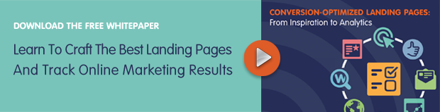
Offering up valuable content like eBooks and whitepapers for your prospects is of optimum importance to keep your sales pipeline full, but how you position those offers is really what could make or break all that hard work. You’ve done your research and designed a beautiful and informative piece of marketing content…now what? How are you going to position that content to convert prospects?
A “forceful” landing page can do the trick, but there are many components of a landing page that need careful consideration. Before you even start the format of your landing page, you need to define the goals of your offer. This can greatly affect how you proceed with the basic components of your landing page. As noted in Unbounce’s Landing Page Conversion Course, components of your landing page are as follows:
- Headline and Sub Header– If it’s unclear what you are offering after reading these two components, you’re doing something wrong. Make sure these are clear and bring in your colleagues to help you define this section. Sometimes you’re so deep into the details of the project, that’s it’s hard to explain the offer from a high level.
-
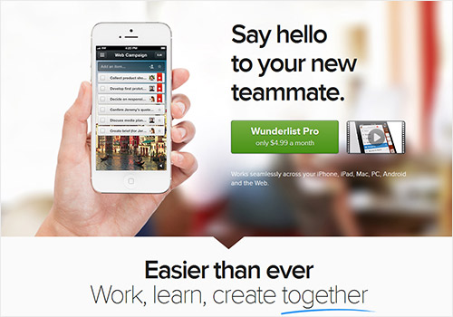
Hero Shot– You’ve heard it the same amount of times that a picture is worth in words…a thousand! The picture should dominate the page. Instead of simply taking a screenshot of the front page, think about giving it some dimension, like this example.
-
Benefits of Offer- How are you solving the problems of the reader with your offer? Make bullet points easy to scan and to the point.
-
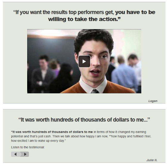
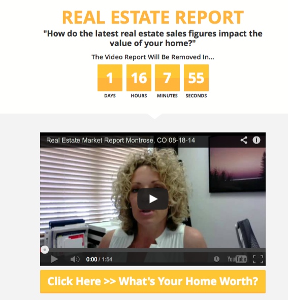
Proof– Proof simply solidifies why the prospect should follow through. Showing quotes from others who have already benefitted from your offer is a great way to prove the validity and value that offer can provide. You can also offer a video testimonial, as in the sample below.
- Call to Action–
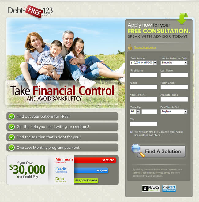
- Form: If you’re looking to get a lot of registrants for a webinar, keep the download or offer form short and the value proposition of that webinar clear. The shorter the form, the lower the quality of your leads but the likelihood of converting more of them. If you’re looking for higher quality leads, make the form a bit longer. Let’s say you’re offering a one-of-a-kind eBook or whitepaper with research that can’t be found anywhere else. Those prospects who download a longer piece of content are more vested in you and the information you offer. Those quality leads will be more apt to give you their contact details plus some and are ultimately further along in the sales cycle.
- Button: How you design a killer call to action button, where you place it, and what it says are all very important to your conversion goal. Check out a few good call to action buttons on Smashing Magazine’s article by Jacob Gube, “Call to Action Buttons: Examples and Best Practices.”
Fear is the Path to Landing Page Conversion Dark Side, It Is

The hot topic issue in creating successful landing pages usually circles around the form and the fear of that form. If the prospect gets to your landing page, likes what they see, and starts filling out the form only to find it difficult and time-consuming, conversion rates can plummet.
It’s not as simple as just asking fewer questions. What questions you ask are just as important, if not more so. Open-ended questions that make prospects think too long can prohibit form completion. You should also stay away from Captcha security input fields if possible. I don’t know how many times that has stopped me in my tracks and caused a high level of frustration.
Asking for an email address is likely the most used form field, but some offers ask for visitors to pay with a social share on Twitter or Facebook. Check out www.PayWithATweet.com to see how you can add this option to your landing page, giving your campaign more social momentum.
The Psychology Force of Landing Page Conversion
Taking your landing page to the next level can be done with some basic psychology. Creating a sense of urgency, offering a try before you buy option, or providing social proof are all tested and proven ways to improve conversion rates on your landing page.
-
Urgency– If visitors believe the number of offers or spots are limited, they will be more likely to pull the trigger and convert by filling out your form. Countdown timers, like the one in the example below, have been known to increase conversions by up to 147%.
- Try Before You Buy- If visitors know there is a way to ensure the value before paying anything up front, then they will be harder to scare away during the form completion stage.
- Social Proof– In this day and age, checking peer reviews and social examples is an important stage in the buying process for almost any consumer. If you can gather and convey that social proof right on your landing page, that’s a win/win scenario. If your offer has a hashtag, even think about having a live feed of others using that hashtag. This proof makes it easier for visitors to trust you and respect the work that you do and the offers you provide.
With These Landing Pages, The Force is Strong
The best way to tie up this post is to learn from other landing page examples out there today. Here are a few of our favorites with notes on why:
-
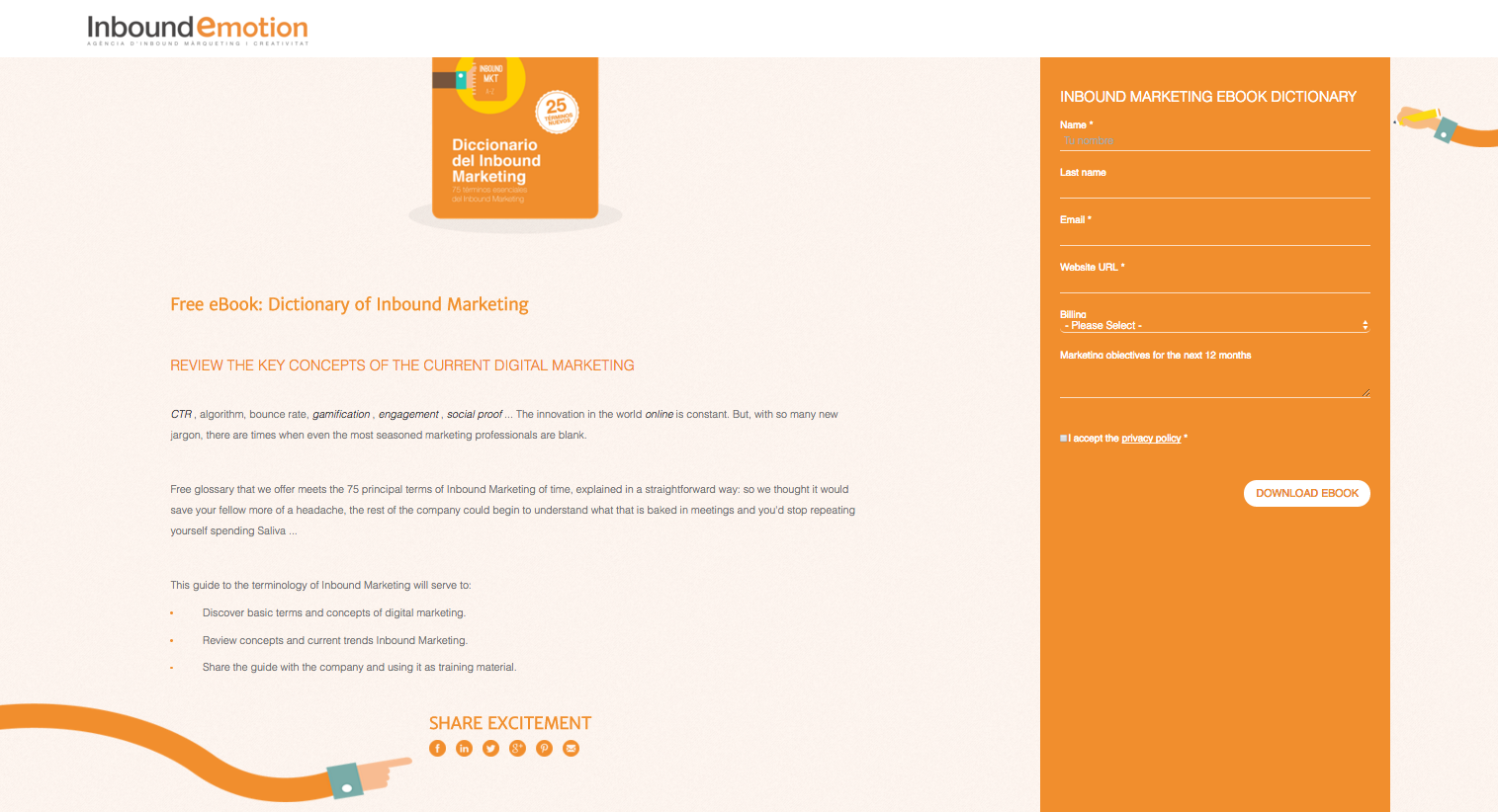
Simple Colors. Simple Design.
Inbound Motion uses a simple yet pleasing to the eye color scheme that’s easy to scan. The hand icons are also a nice touch to direct the visitor on where to download and/or share the eBook on social media.
-
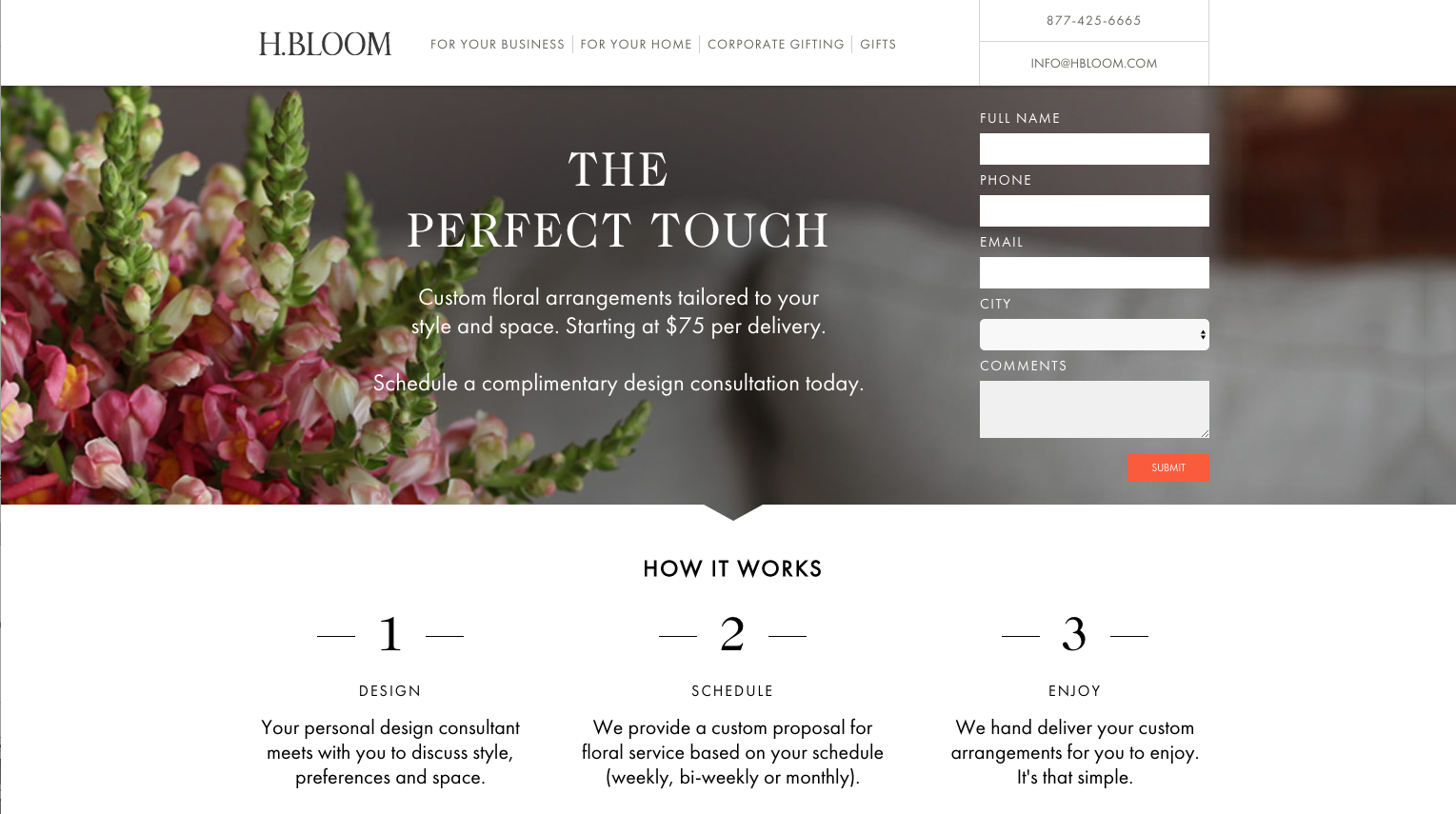
Beautiful Photography and White Space
H.Bloom has many things going for their landing page all above the fold. Beautiful, high quality art with a well-designed form embedded right within the picture. Below the fold, it gets even better with a clear three step process any visitor can follow and appreciate.
-
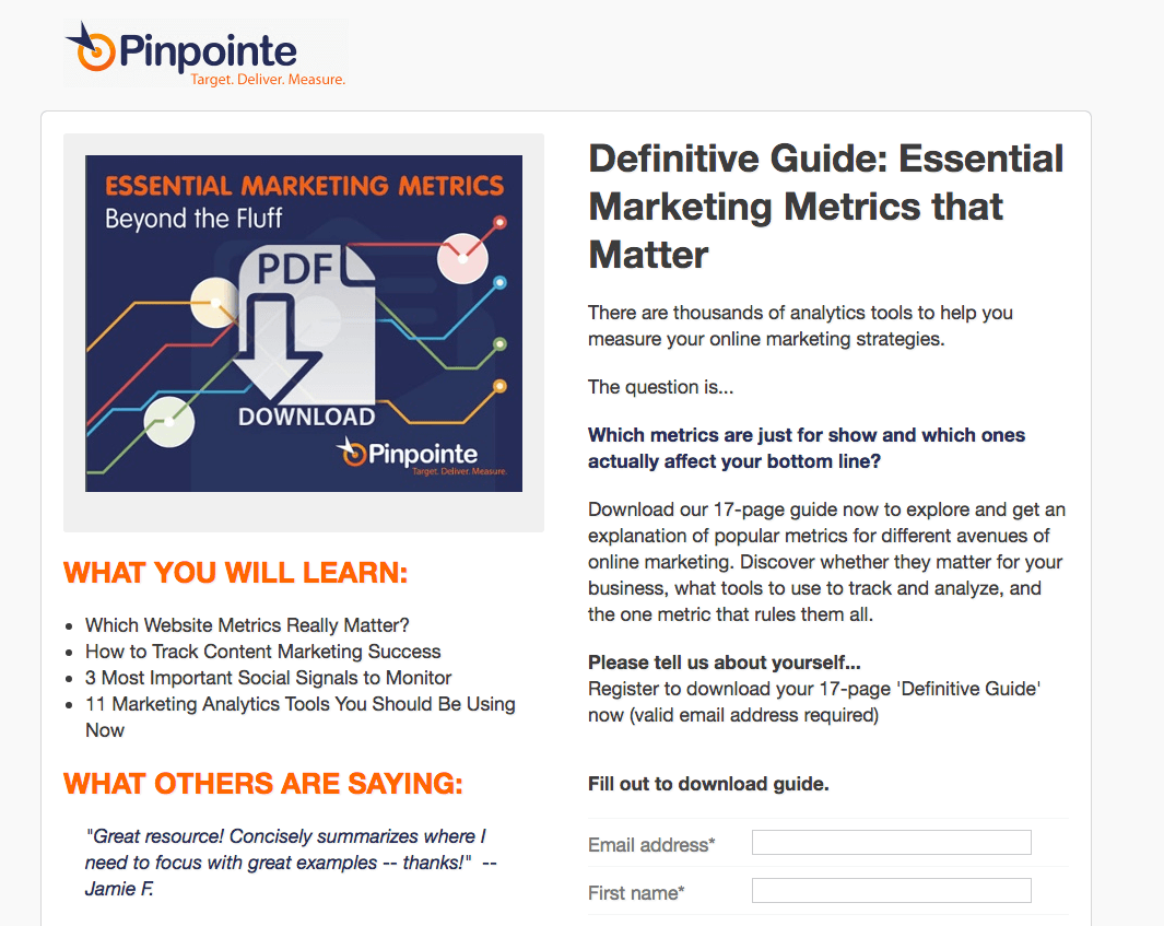
Engaging and Convincing
Our very own eBook landing page for Essential Marketing Metrics follows some very important guidelines including a clear value proposition, social proof, and a clean design that helps direct the reader quickly. We also take your privacy very seriously so have added transparent procedures we follow, hoping to develop trust with our readers even more. The sample below yeilds a 48%+ conversion rate.
Creating a landing page that converts isn’t as simple as an image plus a download form. A lot more goes into creating a page that will inform, engage, and entice your visitors to act. The basics of a landing page are essential, but we hope this blog will cause you to push the envelope a bit further. What can you do differently to improve the effectiveness of your landing page? You’ve spent all that time creating the content, why not make your landing page equally as great? And once more, may the conversion force be with you!