You’ve just created a stellar email campaign. You spent time crafting the right message, selecting appealing visuals and making sure your call to action stands out. You hit send and…nothing. Radio silence, or in this case, email silence. What happened? Why didn’t the email work?
It’s a common problem. Many businesses create emails with high expectations only to have those expectations shattered when their whitepaper isn’t downloaded, their product doesn’t sell or no one signs up for their webinar.
If your email campaign doesn’t perform, it’s time to make some repairs. Like a mechanic fixing a car, there’s a diagnostics list that you can run to see why your email is sputtering.
Using your metrics, you can narrow down where the problem is. It’s like a mechanic listening for odd sounds to get a general idea of where the problem stems from.
Using your metrics as a guide, here’s what you can do to get your email up and running again:
Problem: Low open rate
A low open rate means your customers didn’t even open your message. It’s like hopping in your car and learning the engine won’t start. What’s the deal?
Here’s the diagnostics checklist for this particular problem:
Check the ‘from label’
Who are your emails from? You want the company name, or the name of an employee associated with the company to appear in the ‘from label.’
Take a look at the snapshot from an inbox below. You can clearly tell who sent the emails. One is from the company, Angie’s List, the other is from Lauren Sozio, who works at Skyword.
Subscribers receive an average of 212 emails a day, and it’s expected to grow to 227 by 2018. With inboxes filling up, subscribers must recognize whom the email is from instantly. If they don’t know the sender, they’ll ignore it, trash it, or worse yet, report it as spam.
Improve your subject line
The subject line is one of the most important aspects of an email. Thirty-five percent of subscribers decide whether or not to open your email based on the subject line alone. So, if your subject line is lacking, you won’t even get your car out of the garage. Consider these changes:
- Make sure your subject line is short
Subject lines should be between 40-50 characters, or about 6 words.
- Creatively describe what’s inside the email
Think of the subject line like a teaser. It should give subscribers just enough information about the email’s purpose to encourage them to open it.
- Personalize the subject line
Personalization tends to get overlooked, similar to some car maintenance. You know you should take your car in for a tune up, but it seems like a hassle. Just as your car benefits from a tune up, your emails will benefit from personalization. Research shows personalized emails have a 29 percent higher open rate.
If you have a reputable email service provider, adding a subscriber’s first name to a subject line should be a breeze.
- Test the subject line
Before sending an email to an entire segment, test the subject line on a small group of subscribers. Use A/B testing to see which subject line resonates best.
Problem: Low clickthrough rate
A low clickthrough rate means subscribers opened your email, but didn’t click on any links inside. It’s like getting your car to start, but hearing an awful noise under the hood.
Here’s the diagnostics checklist for this particular problem:
Check your message
Is your message simple and easy to understand? If you’ve written two paragraphs of text to explain something, your message isn’t clear. The second subscribers get lost, or confused, they’ll close your email and forget about it.
Check your images
What do images have to do with subscribers clicking on links? Strong visuals draw the subscriber in. They’re compelling. A stunning image might be enough to capture a subscriber’s attention, and lead their eye line to your message and call to action. Follow these tips:
- Pick images that are colorful
Research suggests images or graphics that are colorful increase people’s willingness to read a piece of content by 80 percent.
- Images of people are compelling
Rather than using a generic stock photo, use an image of a real customer or client.
- Make sure the images are relevant
Be picky with images. Don’t just pick any old photo. It has to complement the text.
Check your call to action
Does your call to action standout? In other words, if a subscriber doesn’t read a word of your message, is it still clear what the purpose of the email is? To make a call to action stand out do the following:
- Make the call to action a button
The main call to action should be a button, rather than hyperlinked text.
- Pick the right color
Make the color of the button one that isn’t used, or rarely used, in your email.
- Use the right wording
You’ll need to add two-three words in the button that describe the action you want subscribers to take. Word choice matters. You want to use action words like, Shop Now, Download Now, Reserve Yours Today or Try it for Free.
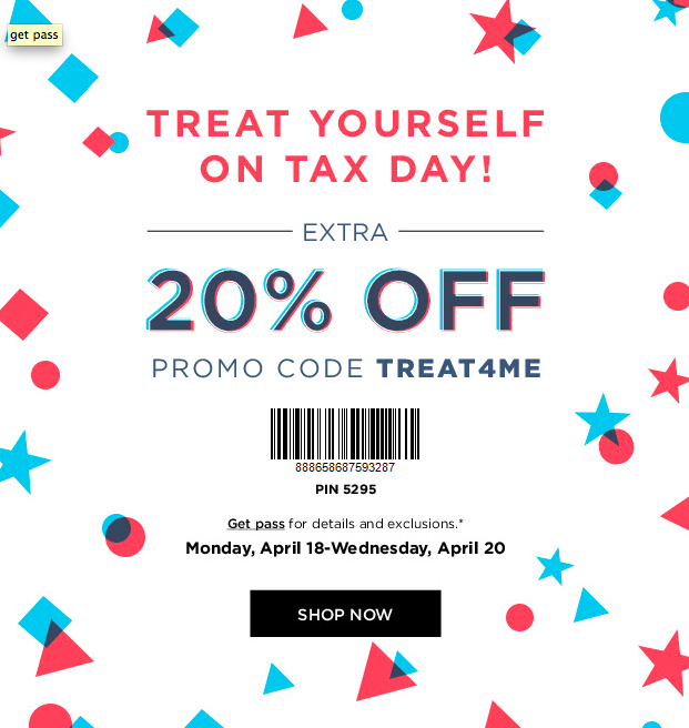
Here’s an email from Kohl’s that exemplifies all of these tips:
Problem: Low conversion rate
If your conversion rate is low, it means customers opened your email and even clicked on a call to action but that’s where they stopped. They didn’t complete the action.
It’s like driving along on the highway rocking out to your favorite song when, all of the sudden, your car just dies.
Here’s the diagnostics checklist for this particular problem:
Check your navigation
Where does the subscriber go when he or she clicks on the call to action? If you want a subscriber to follow through with an action, they should be directed to a page that allows them to buy the product or download the app in a few easy steps.
Let’s say your email encourages subscribers to buy your new product, but the call to action takes the potential buyer to your company’s main webpage that doesn’t even mention the new product. The buyer isn’t going to spend time looking for the product on your site. You have to make it simple. Direct them to a specific page that shows the product and allows for a quick online purchase.
Check for consistency
The messaging, look and tone that you use in your email should be consistent with the page that subscribers land on when they click your call to action. It reassures the customer that they’re in the right place, and following through with the action mentioned in the email.
Take a look at the email sent by Babies R Us below that encourages mom’s to come to an event:
When subscribers click on the “Learn More” call to action, they are taken to the page below. Notice how the look is consistent with the email.
If things look different and subscribers aren’t sure if the product or deal matches what they saw in the email, they’ll likely bail before completing the transaction.
Check your value statement
Did your email explain why the subscriber should follow through? Your email should explain why buying your product is valuable, or what lessons will come from a webinar.
Since your email copy should be short, consider using a two or three-point bulleted list to outline the value of a product or service.
This is sometimes overlooked by small businesses, but it’s an important aspect to include. If you forgot to include this in your recent email campaign, make a note to include it in the next one.
Wrap up
At some point, everyone has car troubles, just like every small business will have a campaign or two that doesn’t perform as it should. When it happens, don’t panic. Work through the checklist and see what changes you can make.
Remember, not to change everything at once. When an email flops, the urge to change a bunch of elements is common, but if you change too much you won’t know what worked. Make small changes, watch your metrics and learn from each campaign you send.


