How many pictures do you take in a week? Smartphones have turned the average person into a photo-crazed human being.
The growth of digital pictures is exponential. In 2015, about one trillion digital photos were taken. By 2017, that number is expected to jump to 1.3 trillion, according to InfoTrends. And, not surprisingly, about 75 percent of digital photos are taken on smartphones.
Taking selfies, snapping photos of our food and taking shots of exotic places that we visit are all common place now. It's not just affecting your social media feed; it's affecting the way businesses send emails to their customers too.
Now, customers expect to see images in their email, and those images have to impress.
To help you understand the impact that images have on your email campaigns, we'll explain why businesses use images in emails and give you some tips to add pictures to your next email campaign that will delight your customers.
3 data-backed reasons to use images in your emails
Aren't sure why you should include images in your email? Here are three reasons, all backed by statistics, which provide the answers you're looking for.
- Images grab attention
When a subscriber opens an email, they're immediately drawn to an image. After looking at the image, their eye line is drawn to the text near it. Research shows visuals increase a person's willingness to read a piece of content by 80 percent. In other words, the combination of images and text provides the best results for your email.
- People crave images
When subscribers were asked whether they prefer images or text in their email, the results were strongly in favor of images. Sixty-five percent of users prefer emails to contain mostly images, compared to 35 percent who prefer text.
- Visuals are easy to digest
Visuals are great learning tools, which is why so many teachers incorporate pictures into their lessons. It turns out, more than half of all Americans (65%) are visual learners. By selecting the right image for your email, you can teach subscribers something about your product, service or brand.
Tips to use images in your next email campaign
To make sure you use images correctly, here's a look at a few best practices that you can follow:
- Use pictures of people
Many businesses use stock photos for their email campaigns, but research shows pictures of people get better results, according to a study from the Nielsen Norman Group.
The study looked at how subscribers viewed pictures of people versus generic photos, and found stock photos are often glossed right over.
The moral of the story here is to use images of people, particularly people's faces. We are trained to look people in the eye, so when an image of a person's face is presented, it's natural for our eye line to go right to their eyes.
Rather than pulling stock photos of people, try taking pictures of your own employees or customers. A genuine photo trumps a stock photo any day. But, if you don't have time to take your own images, find stock photos of people that don't look posed. Look for more candid photos to use.
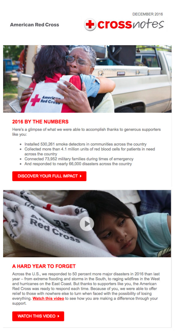
Here's a great example of an email that uses pictures of real people:
Both of the images in this email are compelling. Why? Because they're of real people that the Red Cross has helped. The Red Cross could use images of the disasters that they respond to, or stock images of people volunteering, but they chose to use images of real people and the results are impressive. The images not only draw attention to the text, but also evoke emotion.
- Use images to show people what's important
Research shows that people are naturally drawn to follow the gaze of others. When a subscriber opens an email and sees an image of person looking at something, they'll follow their line of sight to see what they're looking at.
Why does this matter? It means you can use pictures to show people what's important in your email. Take a look at the email below, for example.
The first thing you look at is the man's face, right? Then you notice that he's looking to the left, so you follow his gaze and land on the jacket. And, not surprisingly, you've just landed on the most important part of the email – the jacket. The purpose of the email is to get subscribers to check out the jacket and follow the call to action to see it on the Rip Curl website. The images in this email tell subscribers what to look at.
- Consider using images from your customers
Need some pictures of your products in use? Turn to your customers. Ask your customers to snap a picture while using your product, and share it on social media. Pick the best photos and ask those customers if you can use their shots in an upcoming email.
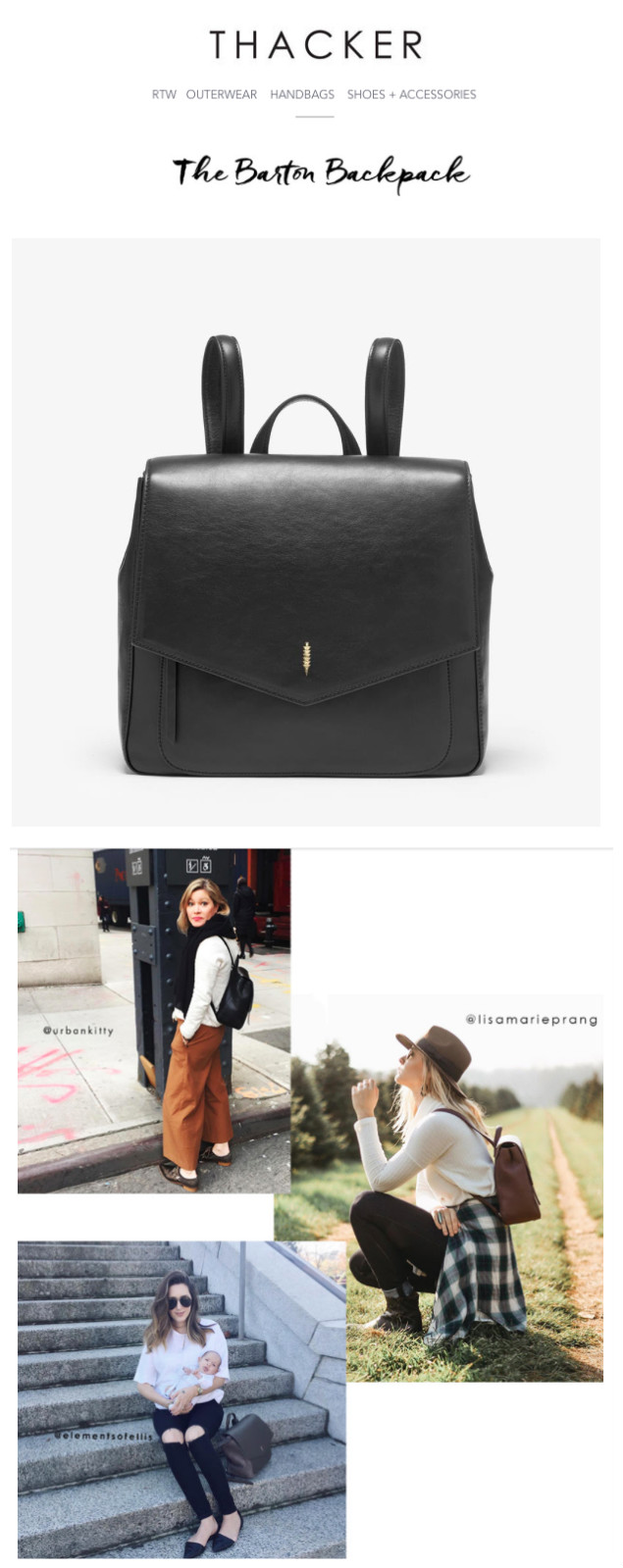
Here's a great example of images gathered from customers.
Thacker, a company that sells handbags, sent an email to their subscribers that focuses on one specific bag. The email showcases the product in a picture, but it also has three images of customers wearing the bag. Thacker even includes the customer's twitter handle on the images.
Consider trying something similar in your next email campaign.
- Spend some money on product photos
While it's effective to use images of people, there will come a time when you want to showcase your products. It's important for product images to look professional; otherwise you'll turn subscribers off.
Consider brining in a photographer to take a few shots of your products. If you sell dozens of products, and don't want to foot the bill for a bunch of photos than just select your top sellers.
Each year, add to your photo gallery. Bring the photographer back to get a few more shots. Eventually, you'll have an entire library of product photos that you can draw from.
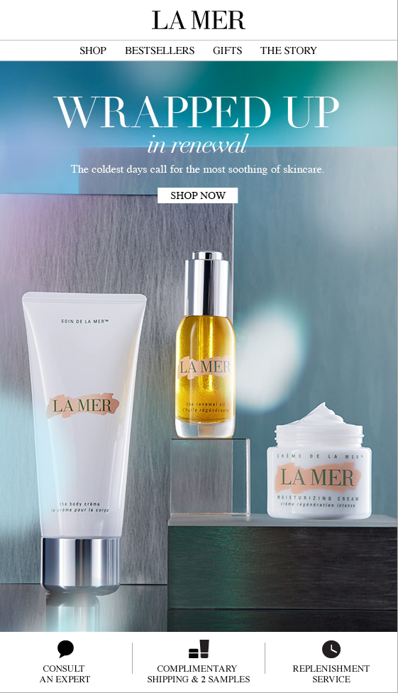
Here's a great example of a professional picture of a product used in an email:
- Limit the number of images in your email
How many images should you use in your next email campaign? There isn't a specific number of images that equates to high open, click and conversion rates. It's all about how you use the images.
You don't want the email to look cluttered, or take away from the text that's in your email. In most cases, the industry standard is to use 1-3 images, with most businesses leaning on the lighter end of that scale.
Before sending your email, preview it to make sure the images enhance your email. If your eye is drawn to too many images, consider removing an image before sending it out.
- Include alt and title text
Subscribers do have an option to turn images off in their inboxes, which means that some people won't see the images that you spend time selecting. That's why it's important to include alt and title text, which shows up in place of the images.
You can use the alt and title text to explain what the email is about, not what the missing image is.
For instance, if the image is of a toddler looking at his shoes, the alt and title text shouldn't say, "Toddler fascinated with shoes" or worse yet something like, "Image 77663." Use the text space to explain the email. Try something like, "Buy one pair of shoes, and we'll donate a pair."
With a message like this, the space where the image should be isn’t wasted.
- Use the right picture format and size
Of course, adding images can affect the download speed of your email. If you use an image that's too big, it could take additional time for the image to load and leave your subscriber frustrated.
To make sure that your images load quickly, the size of your images should be between 100 to 500kb, according to Experian. If you can keep the image size between 100 to 200kb, that's even better.
File format makes a difference too. If you're using a picture, save and upload the picture as a jpg. If you're using an illustration, go with a gif as the file format to ensure quick download speeds, suggests Experian.
- Use heatmaps to test images
Pinpointe users have access to heatmaps, which can show you the "hot spots" that subscribers are drawn to on a specific email. Once an email is sent, you can log into your account and access the heatmap. If your image is drawing attention, it will likely have a "hot spot" on it, and you'll know that you selected the right image. If it's not, you can make changes to your next email and check your heatmap again.
Learn more about Pinpointe's heatmaps and how to use them.
Wrap up
Images are powerful, but they're meant to complement your email message not overpower it. By using the tips above, you can include images in a fun and tasteful way that encourages subscribers to act.

