Remember how Einstein reportedly said “The most powerful force in the universe is compound interest?" Ongoing testing leverages that force.
If you could get just a 3% improvement per week from your email campaigns, what would that mean at the end of a year? Well, if you started out in January earning $100 per email, a 3% improvement per week would have your last email of December earning you $465.10. That’s more than a fourfold increase in sales from a very modest uptick every week. Who wouldn’t want to take a shot at that?
With the New Year coming up fast, many of us are already planning January campaigns. To give you some inspiration for how to make 2015 the year of the test, here are 52 different elements to test in your emails. You may not get to every one, but there’s more than enough here to keep you busy for awhile. And just so you’ll have everything you need to start testing, we’ve added a step by step tutorial for how to set up split test tests in your Pinpointe account.
So here’s the 52 pickup of best email tests, grouped by email element or type of test.
What to Test in Email Split Testing
Timing
1) Day of week. This could be Tuesdays versus Thursdays, or weekdays versus weekends. We have a report about the best and worst times to send email. While that can help you structure your timing tests, it’s always better to know what works for your own list.
2) Time of day. Mornings versus afternoons or evenings.
3) Emails delivered according to time zone versus sent all at once. This can make a big difference if you’re an international company.
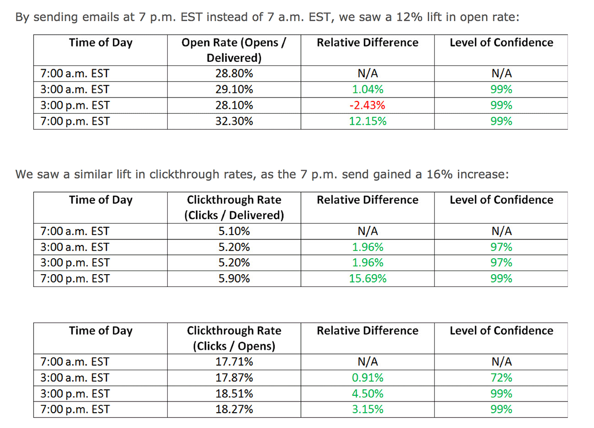
MarketingExperiments.com gained nice lifts in both open rate and clickthrough rates by testing when they sent their emails.
Frequency
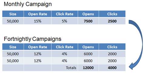
4) This is usually twice a week versus once a week. But if you’ve been sending campaigns monthly, try weekly emails. This test by Zettasphere shows how clickthrough rates went down when they doubled email frequency, but overall they got almost twice as many clicks.
Call to action
5) Image versus link. Everyone once in a while, links outperform images.
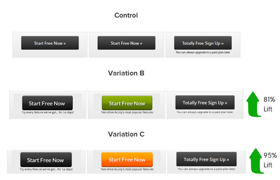
6) Color of call to action. Red buttons, or green buttons, or orange buttons?This button color test from CopyHackers shows just how powerful the color of a button can be. It’s no wonder Google tested 41 shades of blue.
7) Call to action phrasing. “Buy now” versus “Order now” can double conversion rate.
8) Different call to action/offer. Offer tests are as important as subject line tests.
9) Position/placement of call to action. Do you have only one call to action at the bottom of the email? How about adding another to the middle, or the top?
Media
10) Video versus no video. Videos can have major impact on engagement rates, but sometimes they curb deliverability rates. You could also test an embedded video versus an image that looks like a video. When people click the image (the fake video) they’d be brought to a landing page where the video automatically plays.
11) Cinemagraph versus no cinemagraph. Cinemagraphs are animated gifs that loop. Done creatively, in a way that supports the core message of the email, they can be dazzlingly effective. The video version of this email from David C. Cook increased click throughs by 43% and donations by 114%.

Header
12) Header colors. Complimentary colors, or contrasting colors?
13) Header image versus text. Sometimes a minimalist header works best.
14) Header layout. Logo on the left, or on the right?
15) Navigation links in header versus no navigation links in header. This is one of the more popular header tests. It doesn’t always give a lift, but it’s worth squeezing into your testing schedule.
Copy elements
16) Postscript versus no postscript. This is a gem of a test. Try at least one postscript test.
17) Different postscript. Try repeating the call to action, or maybe adding a second call to action. Or even adding the postscript as an image in handwritten script. Postscripts are so effective they deserve more than one variation.
18) Closing. A formal close, or something more casual? Signed by someone at the company, or from a mascot?
19) Greeting. It’s the first words of the email. If you can charm them, they’ll keep reading.
20) Preheader text. This is the most neglected part of emails. Preheader text appears right next to the subject line in the inbox. Yet too many marketers leave it with the default “To view this email as a webpage, click here.” You can do better.
21) Tone of the copy. Professional, or familiar?
22) Paragraph length and other formatting. Paragraphs of more than five lines are hard to read. What if you tested how paragraphs of three lines or less do?
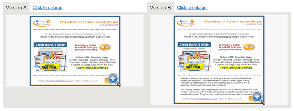
23) Long copy versus short copy versus very short copy. This is a classic test. It’s been around since copywriters first sent postal mail. Copy length is still one of the most debated topics among copywriters. Version B got 247% more clicks than Version A in this WhichTestWon copy length test.
Layout and design
24) Plain text versus HTML. Another critical test. If you could only do ten tests, this would make the list.
25) Layout. For both desktop and mobile. Layout tests could include one column versus two columns.
26) Font size and typeface. WhichTestWon.com recently ran a test where an email with 14 point Calibri got 70.7% more clickthroughs than an otherwise identical email with 12 point Arial.
27) Images. So many tests to run here. There’s a reason the main image is called a “hero shot”.
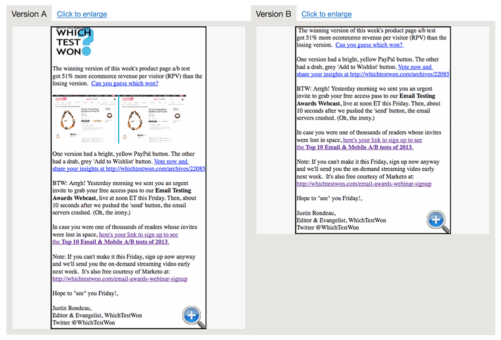
28) Number of links. Should you focus their attention on one call to action, or give them a buffet of ten links to choose from? The HTML version of this split test got 11.2% more clickthroughs than the text version. Courtesy of WhichTestWon.
Footer elements
29) Unsubscribe at the top and the bottom versus just at the bottom.
30) Social sharing and social account icons. Test the placement and size of these images.
31) Text reminding the subscriber how and when they signed up. This can reduce unsubscribes and spam complaints.
32) Social proof versus no social proof. Show follower counts versus no follower counts. Sender information
33) Personal name versus company name as sender. Sender name is more visible than the subject line in some email clients. Test it at least twice.
34) Company email versus personal email return address. Want to make a formal company seem more approachable? Having emails come from an actual person can help.
35) From line. Sender information is critical. Even minor copy changes, like “Co” versus “Company”, matter.
Personalization
36) First name in the body copy versus no first name in body copy.
37) First name in greeting versus no first name in greeting. If you’ve got the names, it’s time to use them. This personalized version of an email sent by Marketing Sherpa got a 137.4% higher open rate and a 128.9% higher clickthrough rate than the unpersonalized version.

Dynamic content
38) Past orders customization versus no past order customization. Buyers who have bought recently are much more likely to buy. It’s worth the resources to try to tip them into ordering again.
39) Content according to users’ website behavior. Behavior is usually a better determinate of purchasing than stated preferences.
40) Content according to user’s signup preferences, interests or gender. Not as good as website behavior, but this can still double earnings per email. See our recent post about the power of dynamic content and how to use the dynamic content features in your Pinpointe account.
![]()
Subject line
41) Length. Best practices may say shorter subject lines do better, but do you know if that really applies to your list?
42) Special characters. These are still widely used, which suggests they’re still working.
43) Personalization. In the subject line, as opposed to other parts of the email. 44) Punctuation. Punctuation can annoy! Or intrigue…
44) Subject lines with numbers in them. These work best when the numbers begin the subject line, as in "23 Ways to Save".
45) Strong adverbs and adjectives. Emotionally-charged adverbs and adjectives make a big difference in headlines. They affect subject line performance, too.
46) Company name versus no company name. If a company name is added, it’s typically at the end of the subject line and in parenthesis.
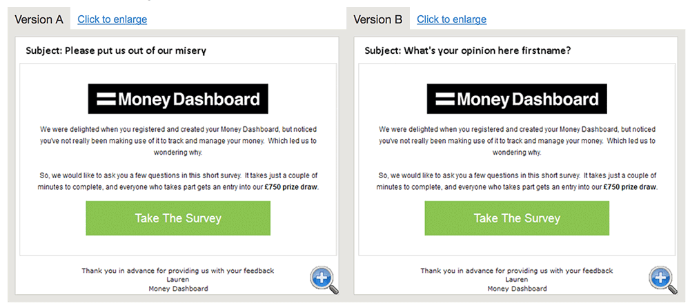
Version A of this split test run by ZettaSphere and Money Dashboard increased clicks from active subscribers by 103%. Inactive subscribers clicked Version A 228% more often than Version B.
Types of Emails to Test
47) Single welcome email versus a series of welcome emails. Welcome emails are email marketing powerhouses. If you’re doing well with a single welcome email now, definitely try a series.
48) Welcome email subject line. Because if they don’t like the subject line, they’re not going read the email.
49) Transactional emails. Suggest other products versus no suggested products. Or suggest related content, like a blog post that mentions an item they just bought.
50) Unsubscribe process. Opt-down versus no opt-down.
51) Unsubscribe process. Suggest they follow you on social media versus no social media prompts.
52) Welcome email with an unexpected coupon or bonus versus mentioning the coupon in the opt-in form. Offering the coupon in the opt-in form will get you more subscribers, but they may not be as valuable as people who would have signed up without knowing about the coupon.

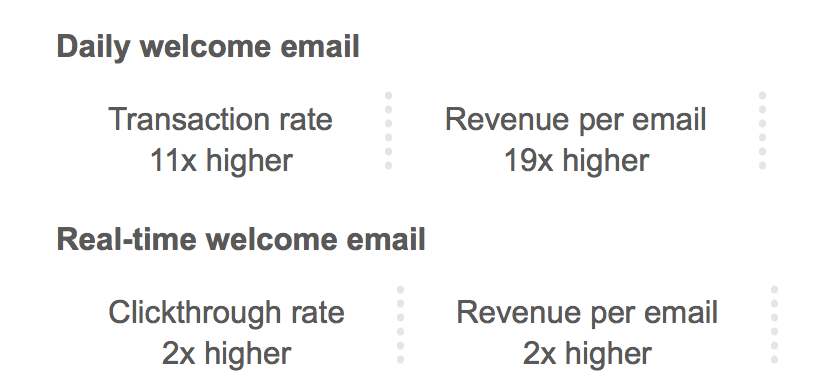
The Sundance catalog got radically higher open rates, clickthrough rates and revenues per email simply by changing how quickly they sent welcome emails.
You don’t have to test everything
Some elements deserve more tests than others. Just because you’ve got a list of 52 items to test does not mean you should necessarily run one test a week for each item I’ve listed. Subject lines and calls to action are critical elements of the conversion process. They deserve more tests than other elements.
Wondering what your fellow marketers test? Here’s the answer:
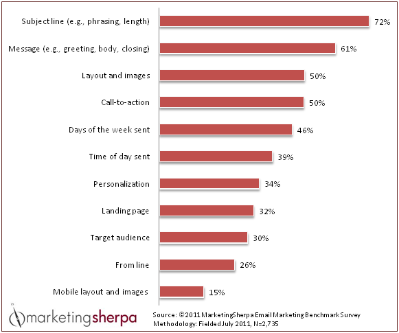
How marketers answered the question “Which of the following email campaign elements do you routinely test to optimize performance?” from MarketingSherpa’s 2012 Email Marketing Benchmark Report.
Now that you've got a blackbelt in what to test, here’s how to test.
How to set up a test in your Pinpointe account
In Pinpointe, you are not limited to testing only two email campaigns. You can test up to eight different emails at once.
1) Create each version of your test as a separate campaign. Email Campaign A and Email Campaign B, for example.
2) From within your Pinpointe account, go to Email Campaigns > View Split Tests.
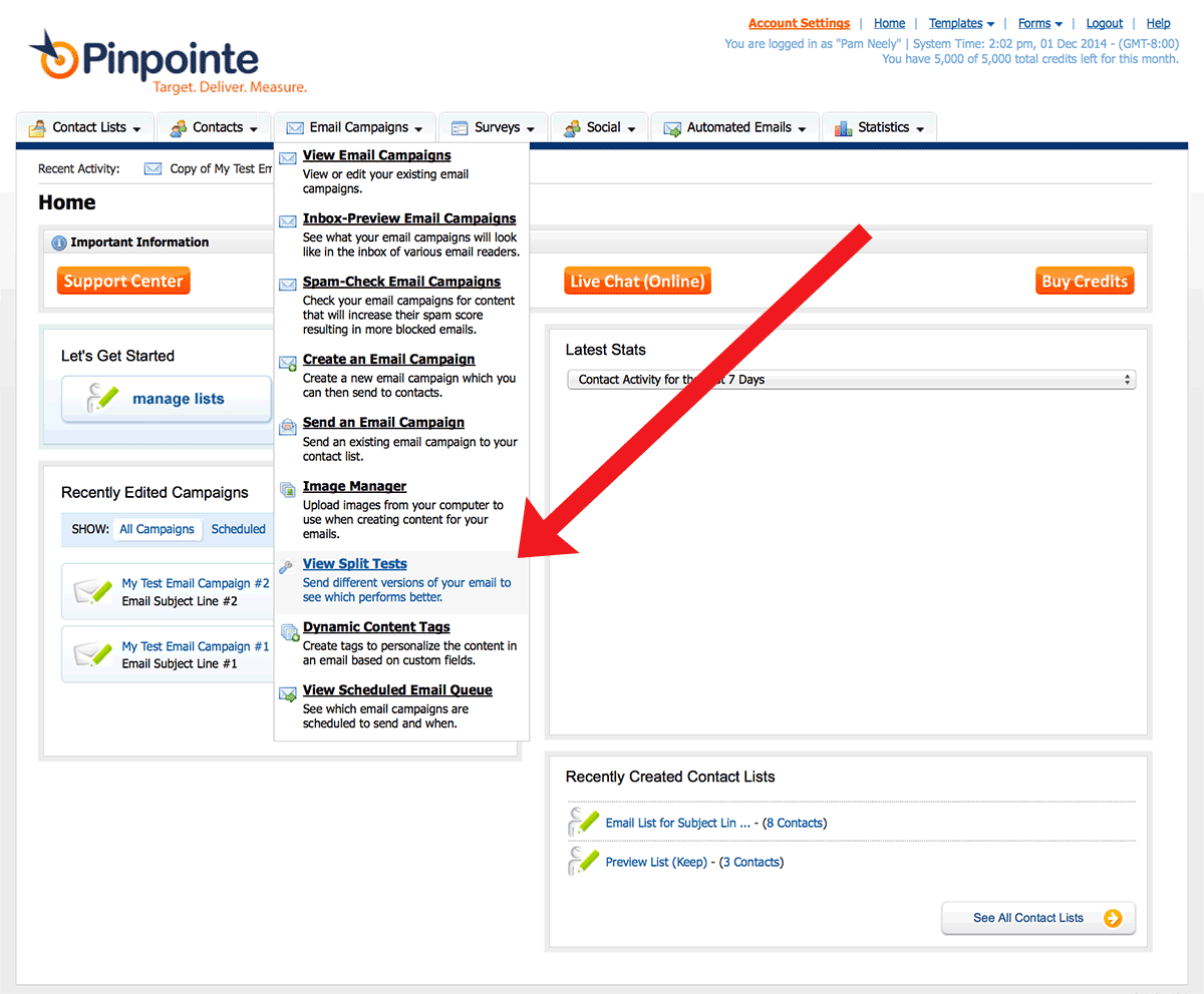
3) Click the “Create a Split Test” button.
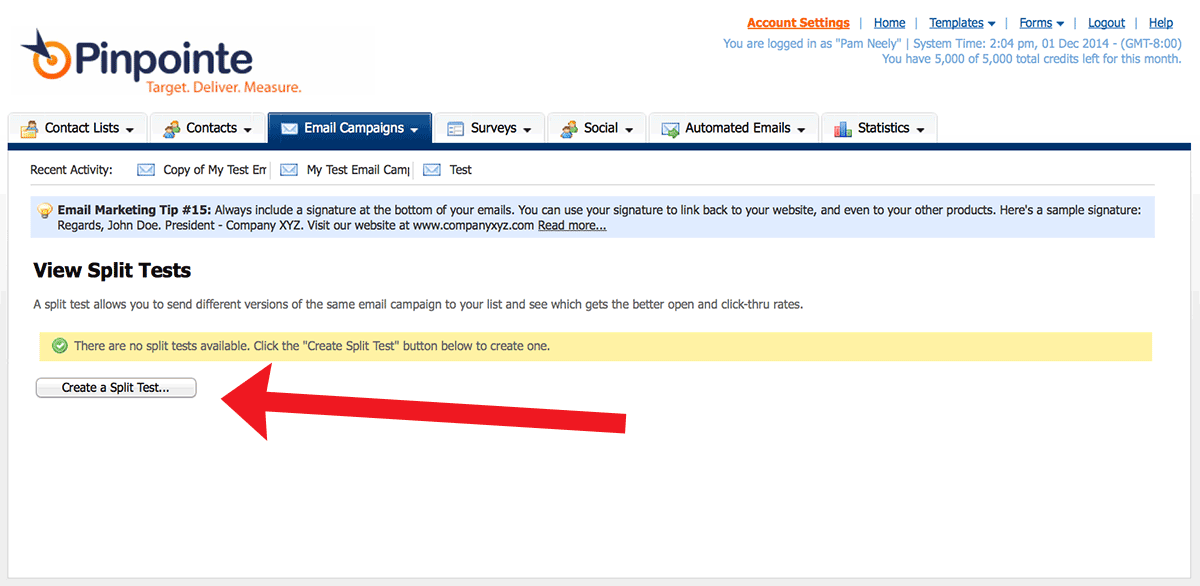
4) You’ll see the split test settings page. Enter a name for your test. Use a name you’ll recognize a year from now. Including a date is often helpful.
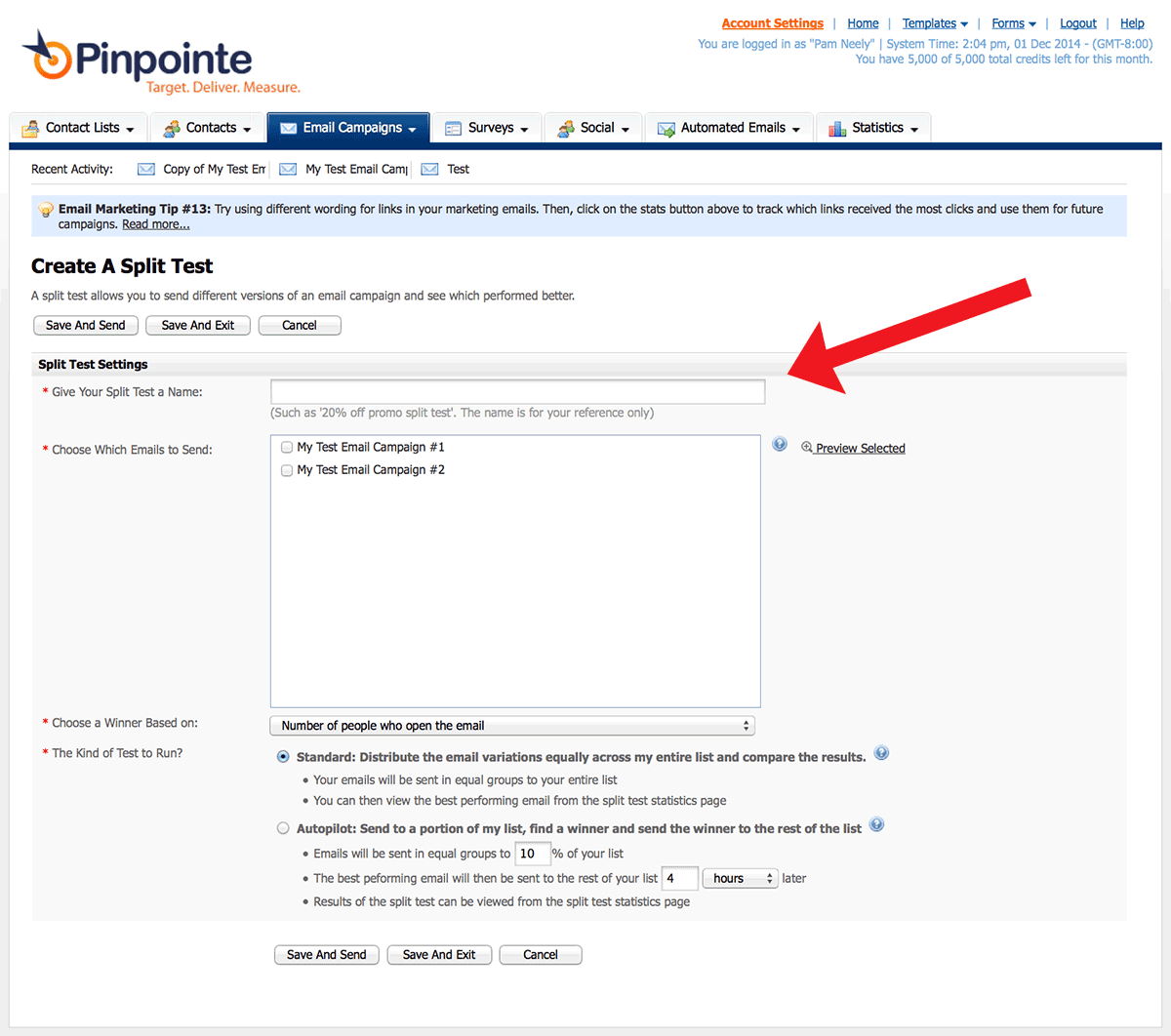
5) Choose the two campaigns you created earlier (you can actually choose as many campaigns as you want)
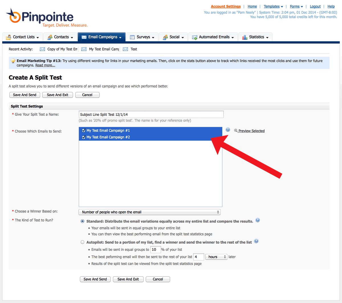
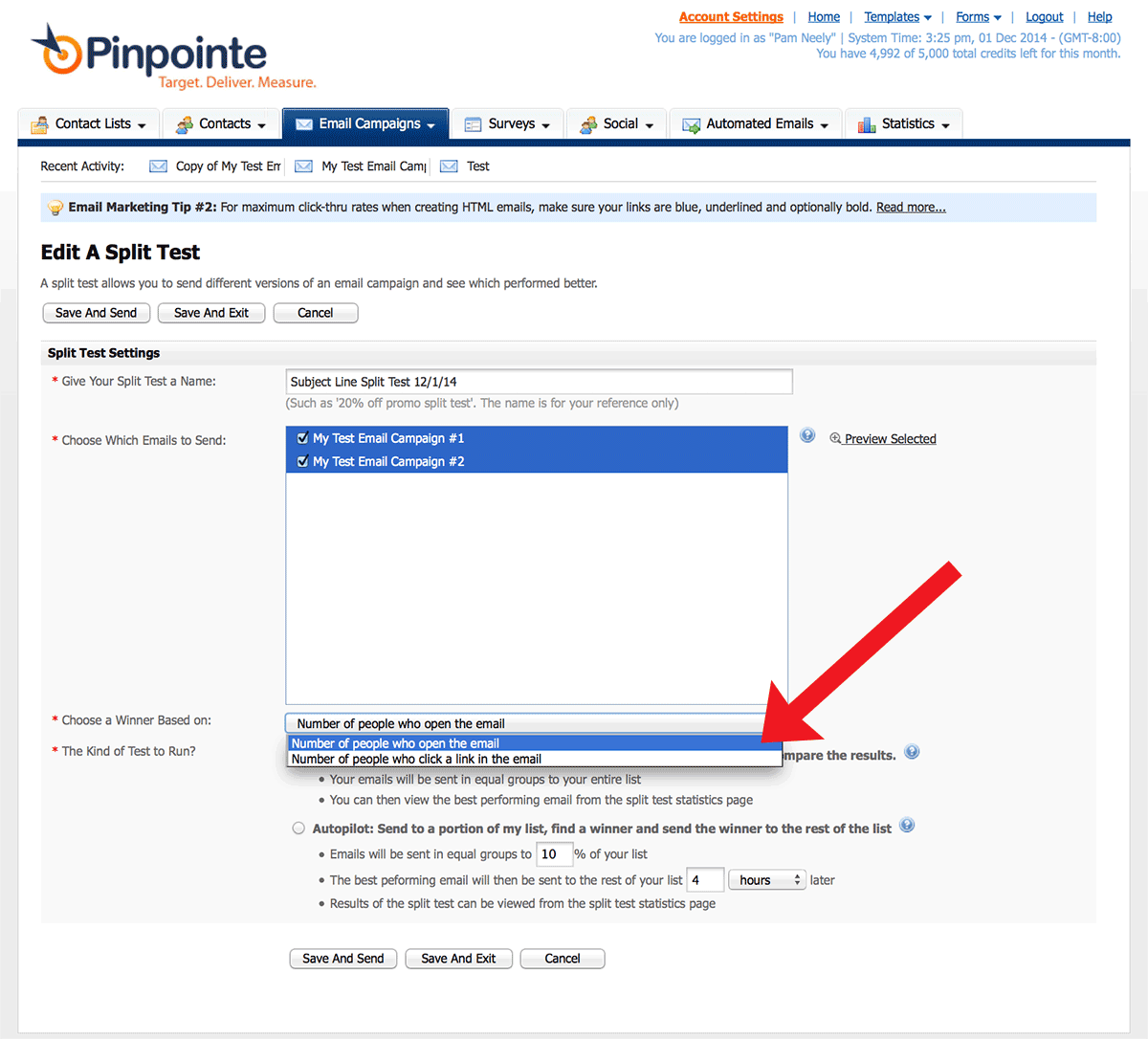
6) Next, decide whether you’ll choose a winner based on either clicks or opens. For this test, I chose opens.
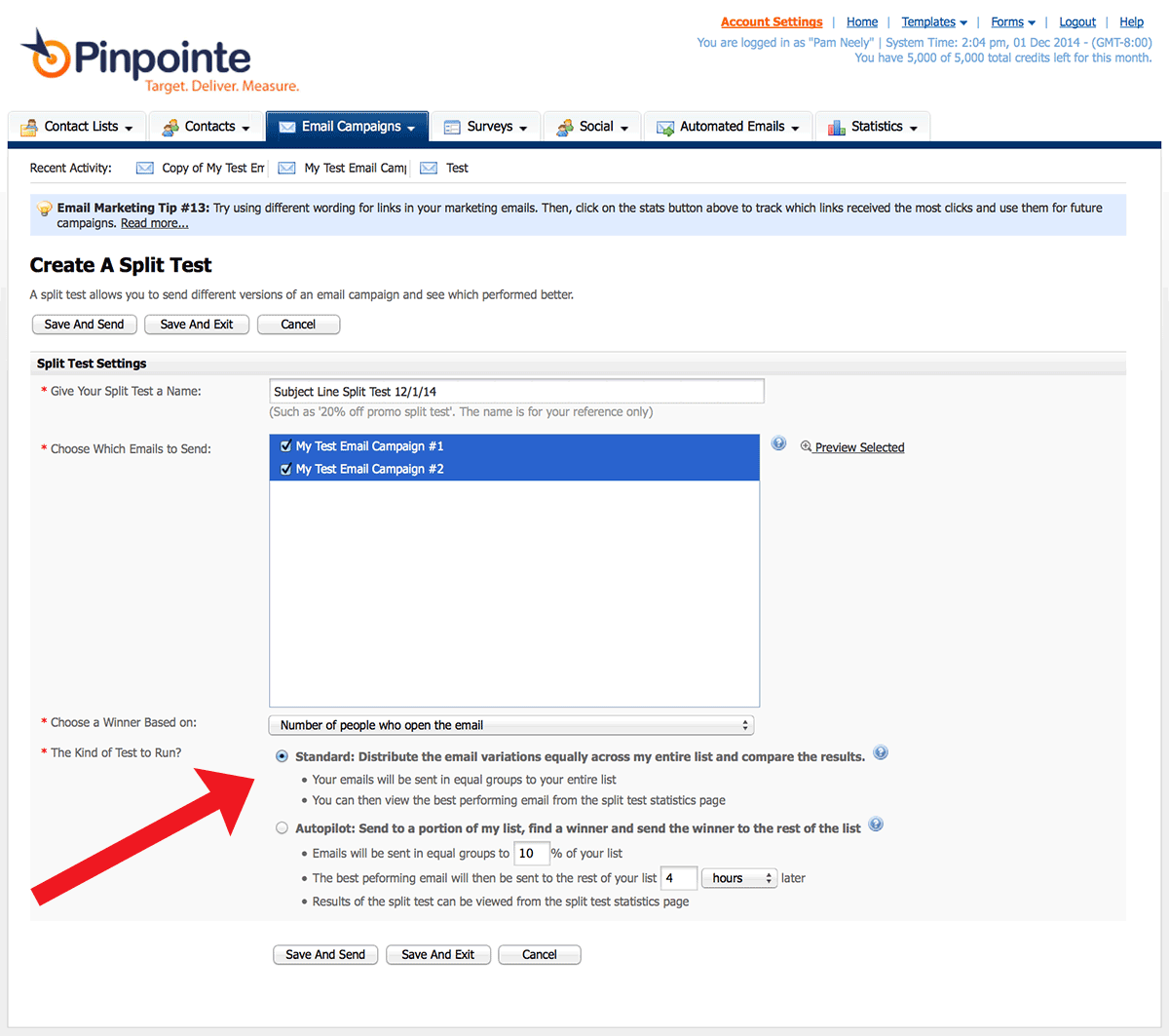
7) The next option is a bit more complicated. You’ll choose between a “standard” test and an “autopilot” test. A standard test just splits your list in half randomly and mails one version of your test to each half of your list. An autopilot test will take a percentage of your list which you can define (say 10%), split that percentage in half and mail one of your test campaigns to everyone in that percentage/segment. So if we used a 10% sample size, each email would be sent to 5% of our list. Once the results are in and a winner is called, Pinpointe then automatically sends the winning email to the remainder of your list. In our example, that would be the remaining 90% of your list.
If you’re not sure which option to choose or if your list is small (like under 2,000 subscribers), choose the standard test.
8) Once you’ve chosen “Standard” or “Autopilot”, click the “Save and Send” button.
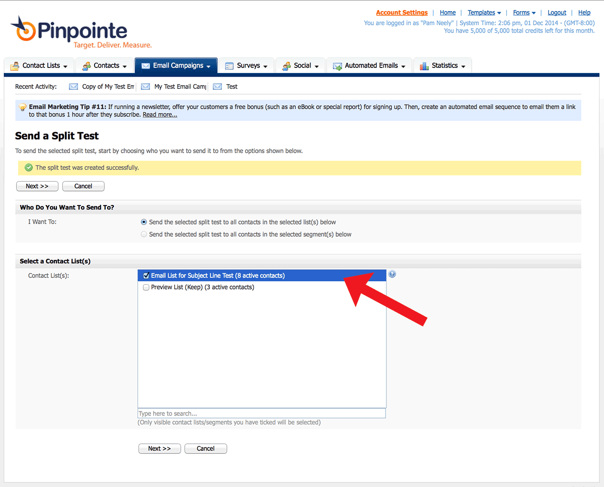
9) Next you’ll see the page where you define who you’re sending to. You can choose from lists or list segments. Click the “Next” button when you’re done.
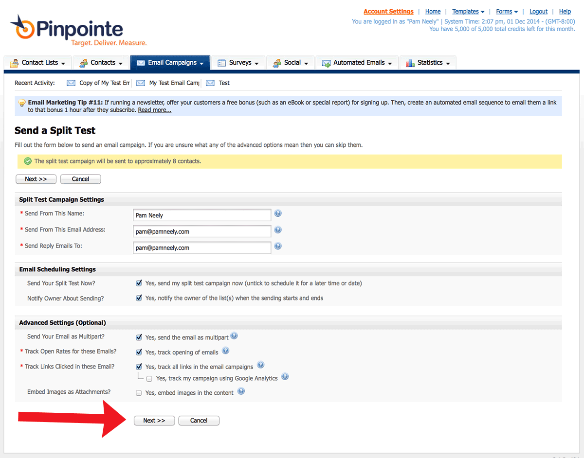
10) You’ll see one last confirmation page where you can control sender information, when your emails will go out, and tracking information. Click “Next” after you’ve made your choices. In this example I left everything with the default settings.
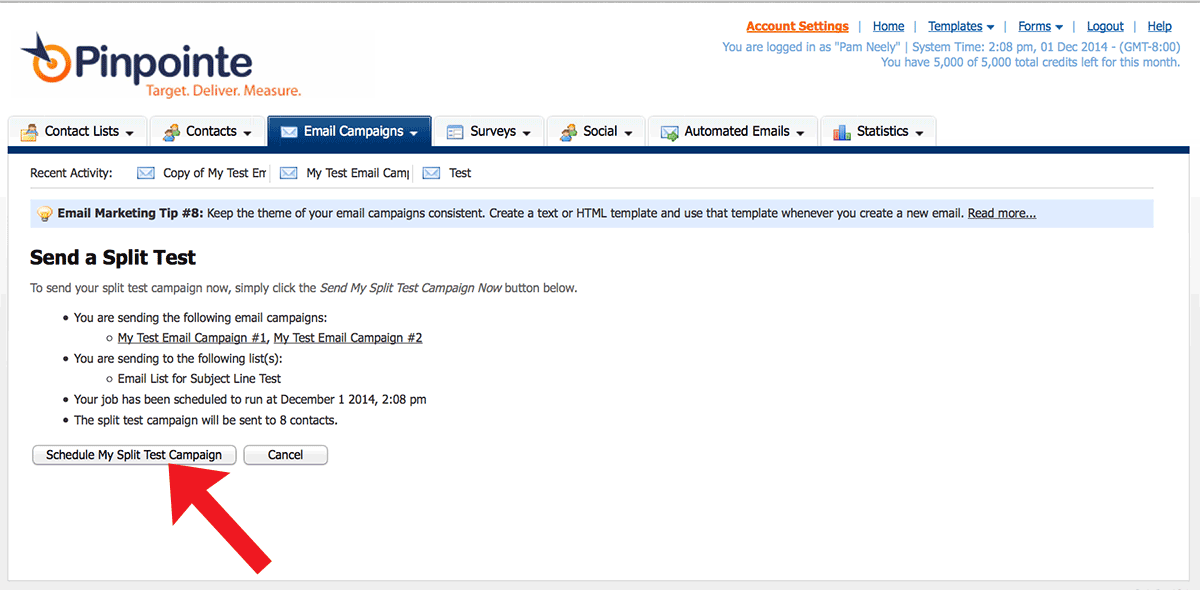
11) This is the final confirmation page for scheduling. If you’ve clicked “Send my email now” in earlier pages, your email will be automatically “scheduled” to go out right away. Just click the button that says “Schedule My Split Test Campaign” to send your emails and start your test.
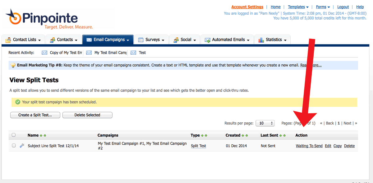
12) You’ll be brought back to the main “View Split Tests” page. See the status of your test under the “Action” column.
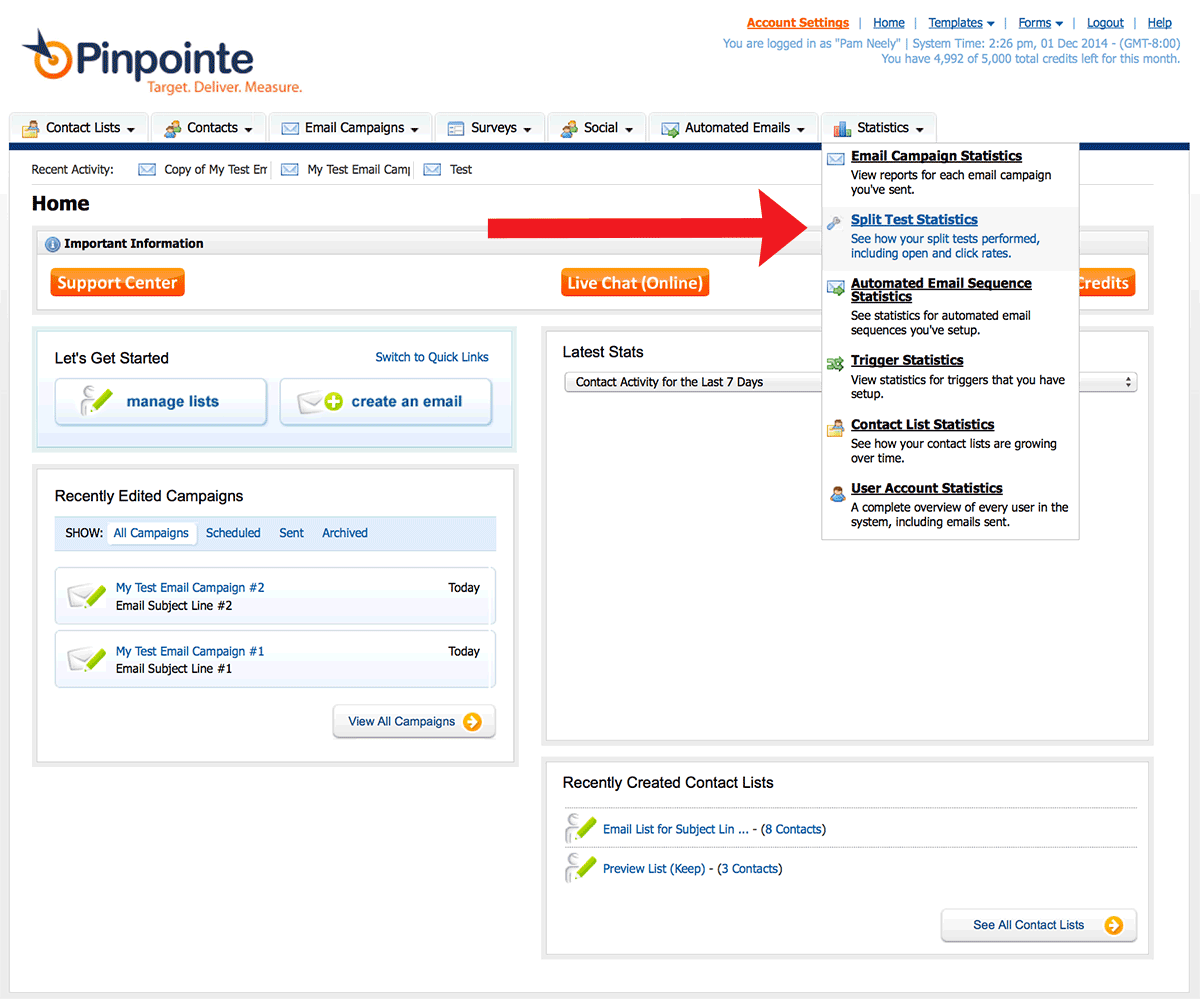
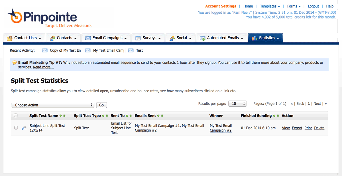
13) Once your emails have been sent and your subscribers have had a chance to open the emails, go check on the results of your test. Do this by going to the “Statistics” tab and selecting “Split Test Statistics.”
14) This is the main page of the split test statistics. Click on the row of the test you want to see the results of.
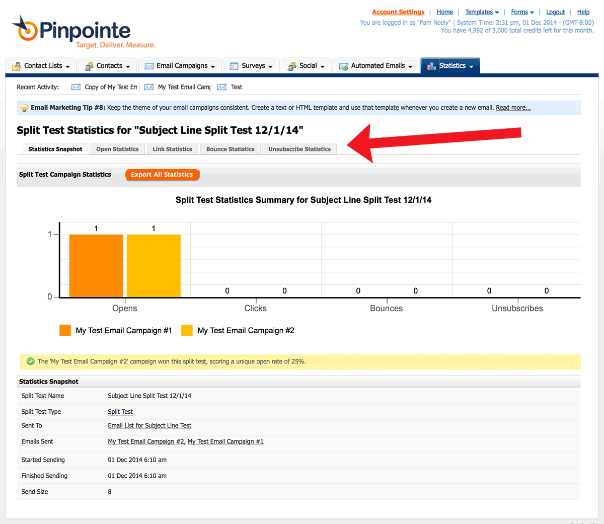
15) Here’s the detailed view of the split test results. Click on the tabs to see information about Opens, Links Clicked, Bounces and Unsubscribe data.
Once you’ve completed a few tests it won’t take you more than 10 to15 minutes to set up each new test. You may not see big results from every test you run, but over time the results will start to add up.
If you have any questions or need to know more about how to run tests for your Pinpointe account, check our Knowledgebase or email customer support at support@pinpointe.com.

