With email being one of the most popular and, by many accounts, the most successful of all online marketing channels used by marketers today, you want to ensure your email design communicates your message properly so it gets reads and inspires action. Good email marketing template design goes beyond choosing the right fonts and images, but also takes into consideration the devices recipients open their emails on and the constraints of the various email clients used by recipients. Your message and the placement of it plays into overall design and readability.
Below are a few design tips that will help maximize email campaign opens.
Let’s start with the basics…
-
Subject Line: Craft an informative and short subject that will grab your subscribers’ attention. Think of the subject line like a billboard…you just have a few seconds to grab the email recipient’s attention and peak their curiosity enough to open your email campaign. Never use ALL CAPS, misleading subject lines and always avoid using spammy words.
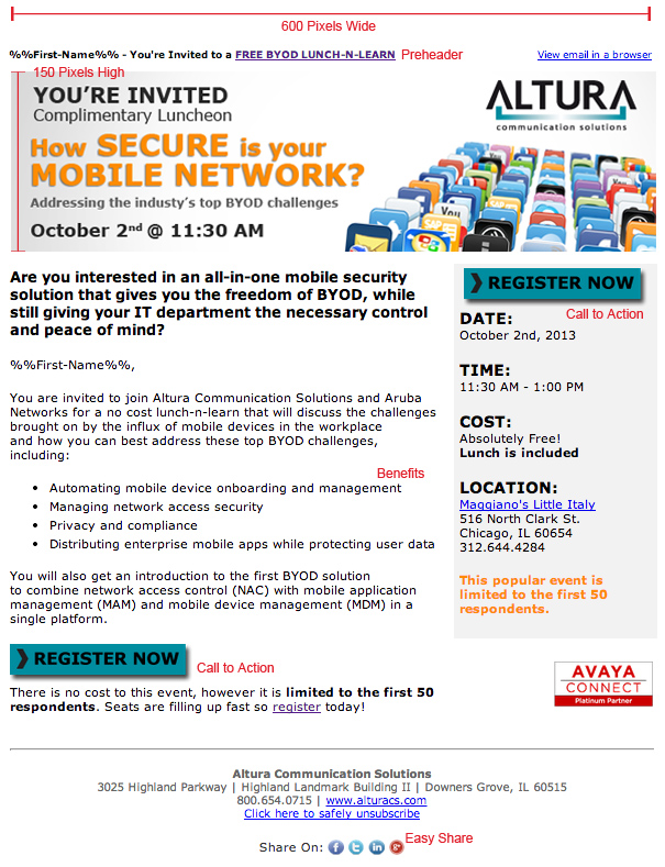
Example: You're Invited: BYOD Luncheon at Maggianos - From Line: Your From Line should include your company’s name.
-
To Line: Personalize the To Field with the recipient’s name and not their email address.
Use Jane Smith NOT JSMith@rexcorp.com
Moving on the pre-header and header…
-
Pre-header: Located directly above the main header image is your pre-header. It should include a link to a web version of your email. You may also want to include a brief description of the campaign’s content that is interesting enough to motivate the receiver to open your email.

- Snippet Text: There are a few email clients that show a snippet (or preview) of text. This text is usually limited to 100 characters or less and is pulled from the first few lines of your email content. Keep this in mind when creating your body copy and try to build on your subject line within the first 100 characters of your body copy.
-
Preview Pane: Many recipients don’t fully open their emails and instead read them through their mail client’s preview pane. The preview pane encompasses the top 400 X 300 pixels of your email campaign. With this in mind, you should design your email to best utilize this space to draw the recipient in and entice them to act. Therefore, you should place your call to action within the space.
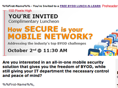
- Header: Try to keep header less than 150 pixel high to avoid pushing your main message and call to action below the preview pane. Also make your header clickable to an actionable landing page.
Let’s talk about the layout…
- Width: The ideal width of an email is 500 to 650 pixels and utilizes a vertical layout. Think about proportion when designing the layout of your campaign.
- Images: Your images should reinforce and clarify your message. Do not overuse images. When you do use images, provide descriptive alt-text for the image in case the email client blocks the image. Try to avoid background images layered with text, as numerous email clients do not support background images.
-
Spacing: Provide adequate spacing and dividing lines to distinguish the content sections from one another.
Copy & Content
- Copy: Get to the point. Remember the purpose of your campaign and keep your message simple. Short sentences and paragraphs and the easiest to read. To draw attention to certain words, use a bold typeface and complementary colors, but don’t go overboard here. Too much color will make your campaign look like a kid’s birthday party.
- Call to Action – Clearly define your call to action.
- Benefits: Use bullet points with short lines of copy to show benefits.
- Fonts: As a rule of thumb, never use more than two fonts. Normally you will want to stick to one web-safe standard font (Arial, Arial Black, Arial Narrow, Comic Sans, Courier New, Georgia, Impact, Tahoma, Times New Roman, and Verdana)
- Font Size: The ideal font size for body copy is 14 pixels and 22 pixels for titles, which provides a decent readability on mobile phones.
-
Grammar: Check, double check and then triple check your copy for spelling and grammatical errors.
Don’t forget the footer…
- Contact Details: Don't forget to include your organization’s contact info. To be CAN-SPAM compliant, you must include your organization’s physical address.
- Unsubscribe: Make sure recipients have an easy way to unsubscribe from your marketing communications. Your unsubscribe link should be clear and easy to find.
- Important Links: Include links to your organization’s home page along with the links to any key landing pages within your site.
-
Easy Share: Including social sharing links and/or ‘Forward to a Friend’ options to make sharing your campaign as easy as possible.
There is never a guarantee that your email campaign will get viewed and read, but with these tips you you can increase your success. Get more marketing tips by subscribing to Pinpointe's Email Marketing Tips newsletter – click here.