What if there was a tool to help a business optimize its website and email campaigns? There is. What’s the tool? You’re probably thinking: A/B testing. While A/B testing is an amazingly effective tool, we’re talking about its older, sometimes-forgotten-about big brother, the heat map.
With a heat map, businesses can see how readers view their website and emails. It provides an inside track to what a subscriber wants, and here’s the best part – it’s readily available and free.
With Pinpointe, you can get a heat map of your website or an email campaign. The information you gather from a heat map can help you tweak your digital communication to attract and retain visitors.
Ready to learn more about this little-known tool? We thought you’d say yes. To help, here’s a list of six frequently asked questions about heat maps and how they can help optimize your website and email campaigns.
1. What does heat map analysis do?
A heat map provides a visual representation of how a reader checks out your email or website. It uses sophisticated software that tracks where a reader’s cursor goes and shows you “hot spots,” which are spots where the reader spends time and clicks, and “cold spots,” where the reader ignores.
2. What does a heat map look like?
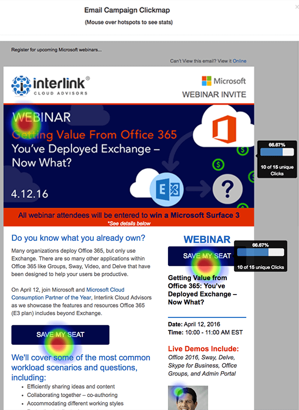
Heat maps provide a colored overlay of your content with spots that indicate where readers click. The red spots in the heat map below are “hot spots.” Areas that are void of color are considered “cold spots.”
3. What are the benefits of heat maps?
Heat maps provide valuable information to businesses. Here are a few things you can learn from a heat map:
- Reader behavior
A heat map shows you how readers view your website or email. Using this information you can design your content to suit the behavior of readers.
- Placement of key messages
If you know how your readers view your content, you can place key messages in those zones to ensure readers consume your message.
- Placement of call to action
Have you ever wondered where the best place for a call to action button is on your website or email? With a heat map, you don’t have to wonder anymore. You’ll know where readers are spending their time and be able to place a call to action directly in their path to ensure higher click-through rates.
4. How can Pinpointe users see heat maps?
Pinpointe offers heat map functions for both email campaigns and websites.
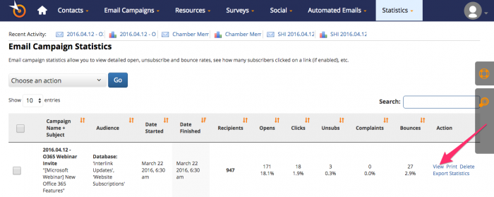
To access a heat map for a specific email campaign, log into your Pinpointe account and go to the Statistics tab on the top right of your dashboard and click on Email Campaign Statistics. Select the campaign that you’d like to see a heat map for.
Here’s what you’re looking for:
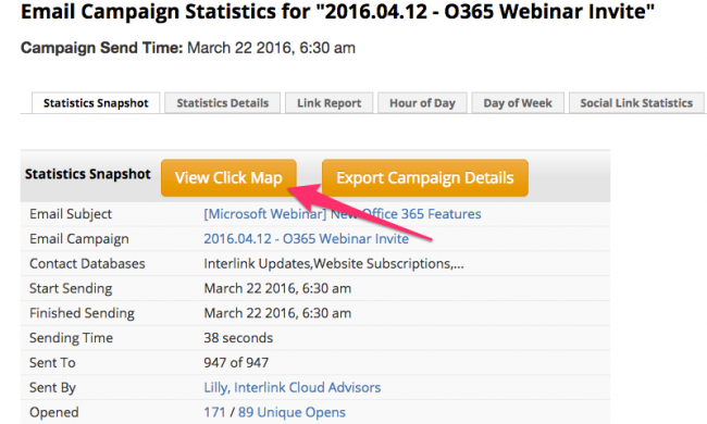
Once the campaign statistic screen appears, click on View Click Map as seen below:
A heat map will appear on your screen that’s specific to that email campaign.
To learn more about heat maps for your website, check out our information on real-time analytics and tracking.
5. How can you get the most data from your heat map?
A heat map is a great tool on its own, but when you combine it with A/B testing you’ve got data that can really make a difference.
Let’s say your current email campaign isn’t getting the clicks that you’d like. Start investigating by looking at a heat map of the email. With this information you can see where subscribers are focusing their time.
Using this knowledge, consider moving your call to action to a “hot spot” on the heat map and then run an A/B test to compare the original email with the new one.
The heat map gives you direction. It takes the guesswork out of the process and gives you a better idea of what to test to make the email successful.
6. What tips can you learn from heat maps?
Heat maps are unique to every website and email, and every business should make decisions based on heat maps from their own content.
However, there are some common conclusions that heat maps provide most businesses. Here are a few tips that heat maps will likely show you:
- Subscribers scan content in an F-shaped pattern
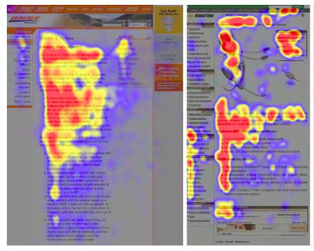
Research from Nielsen suggests readers scan content in an F-shaped pattern. First they glance horizontally across the top of the page, forming the top of F. Readers then move down and scan horizontally again, forming the F’s lower bar. Next, they vertically scan the left side of the page.
Here’s what the heat map looks like from the Nielsen research:
This gives you an idea of how readers are checking out your website and email. That said, you should still refer to a heat map from your own website or email to get the most accurate results. Once you have this information, you can alter where important messages or calls to action go.
- Create “scannable” content
As readers move their eyes across your content in an F-shaped pattern, they aren’t reading every word. In fact, research shows that 79 percent of subscribers scan content.
Why is this important? You should make changes to your content to accommodate this behavior. Keep your email messages short, use bold fonts for key messages and use bulleted lists to make sure a reader gets the most information possible when scanning your content.
- Prioritize your content
Whether you’re crafting an email message or writing content for your website, it’s important to prioritize it. In general, heat maps indicate that less than 50 percent of readers scroll down, so placing the most important information at the top of the page is important.
For email, putting the main message at the top is fairly simple. It gets a little more difficult when you’re talking about website content though. Let’s say you’re writing an “About Us” page; that’s going to take more than a few lines.
Before sitting down and writing four or five paragraphs of text that describe how your business got started and where it is today, craft an outline first. The outline will help you prioritize the facts that you want to highlight; making sure the most important details are in the first few paragraphs.
- Use images of people
The eye is naturally drawn to images, so it makes sense that “hot spots” coincide with pictures. However, any random image won’t do. The most eye-catching images that light up a heat map are those with real people.
When you’re designing an email or a page on your website, don’t reach for the first stock photo you find. Take time to select a photo that has faces. Try not to select a photo from the first page of the stock photo site either. Odds are, the pictures is being used somewhere else online, so dig a little deeper and use a photo that’s less popular.
If you have pictures of employees or customers that fit the bill, that’s even better. Just make sure you have their permission to use their photos online before publishing them.
- Make a call to action standout
Whether you’re adding a call to action button to your website or email, it has to standout. If it blends into the background, it won’t get noticed.
Use your heat map to judge the best placement. In addition, consider making the call to action a button, use a contrasting color to draw the reader’s eye or use a font that’s bigger than the rest of the text to make it pop.
Wrap up
Businesses should use every marketing tool that’s accessible to make sure websites and emails are performing at an elite level. A heat map is one of those tools. Effective use of heat maps can help businesses drive website traffic and attract and retain customers, which, in turn, increases revenue.


