To create a high-performing email, you need to build it with the right components. When Ford builds its Mustang, top-of-the-line parts are used to create a driving experience like no other.
An email is the same way. Every part of an email should be the best it can be to ensure subscribers get the best experience possible.
One of the most important components in an email is the call to action, and that’s what we’ll focus on in this article. We’re going to give you twelve in-depth tips that will help every business create killer calls to action that convert subscribers.
Here are the tips to create must-click calls to action:
Call to Action Wording
What will your call to action say? You need to pick several words that entice the subscriber to click. Here are copy tips to create a variety of call to action messages that convert:
1. Keep it short
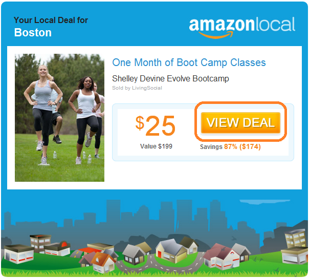
A call to action should be fairly short. There’s not a hard and fast rule on the length of a call to action, but most are about 2-5 words long. Amazon Local uses 2 words in the example below:
That’s not to say there won’t be times when your call to action is 7 words, but a call to action should be clear and brief.
Remember, the call to action doesn’t work alone. It’s supported by the message inside your email, so use the body of your email to convey the entire message. Your call to action should simply activate or reinforce that message.
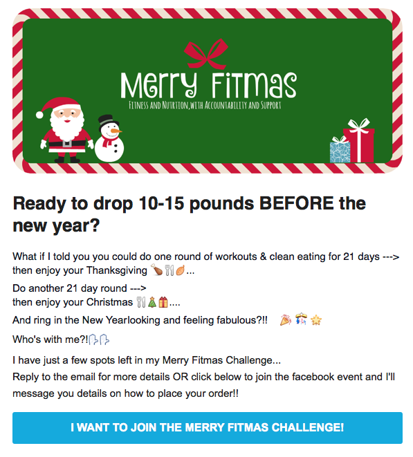
Another good tactic is personalizing the call to action and using words like "Get My…," "Take Me To…," and "I Want To…" like in the email example below.
2. Capitalize on the fear of missing out
Everyone wants to be part of the in-crowd. If there’s a possibility of being left out of a good deal or a limited number of products, customers will act fast.
If you have a set number of products that you’re releasing, a deal that only comes around once a year or a product that’s likely to run out fast, make sure your call to action reflects it.
Here are a few examples of calls to action that you can use:
- Claim your limited-time offer
- Get it before it’s gone
- Don’t miss out, buy now
- Buy a limited-edition (name of product) today
- Shop the biggest sale of the year
3. Create a sense of urgency
A call to action should create a sense of urgency, so you should choose words that encourage such. Use present tense, active words that make subscribers follow through with your desired action. Use words or phrases like “now,” “today,” “act fast” or “redeem instantly.” Any word choice that compels a subscriber to act immediately is the right choice.
4. Try adding prices
If a subscriber clicks on a call to action that includes a price, it shows a high level of interest. The customer knew your price point and took the next step. That’s a customer that’s close to converting, and worth identifying.
Here are a few examples that include price points. Consider tweaking theses ideas to fit your product or service.
- Book a cleaning service for $50
- Shop TVs under $300
- Upgrade your account for $5
- Shop $20 holiday gifts
- Find the perfect gift for $10
- Shop popular $20 gift sets
- See how far your $50 can go
5. Include an incentive
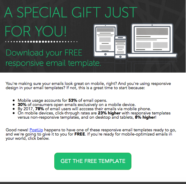
Your call to action text could include an incentive. Why should customers click on your call to action? Can they save 50%? Try something free for a month? Upgrade for a one-time fee? Whatever the incentive, consider adding it to your call to action.
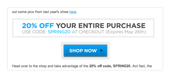
The example below includes an incentive. It does make the call to action longer than usual, but the incentive could convert more subscribers.
Other incentives could include, “Activate your 50% off coupon now,” or “Get a free gift with your $25 purchase.”
6. Go (a little) extreme
Some brands can go out on a limb and choose words that are a little extreme. Words that grab attention, are trendy or even a little risqué might be just what you need to boost click through rates.
If you market to the younger crowd, speak their language. Use trendy words like “selfie” or “totes adorbs” in a call to action.
Even if your target audience isn’t millennials, you can still create an out-of-the-ordinary call to action. For example, rather than saying, “Download the Healthy App Now” try something like “Ditch the Crappy Diet.” The second option pushes the envelope a little; it’s not stuffy corporate speak.
These choices aren’t for every brand. If language like this doesn’t fit with the overall tone of your brand, don’t force it. Above all else, stay true to your brand voice.
Button creation and placement
In most cases, a call to action button is better than hyperlinked text. It stands out and is easily recognizable to subscribers. However, there’s more to creating a call to action button than you might think. Here are a few pointers:
7. Create the best button size
How big should your call to action button be? Good question. You want a call to action button hat works on every device.
Email templates are built with a responsive design, so if you’re using an email template from an email service provider the button size will adjust to fit the user’s screen.
However, you can customize buttons with third party button creators like ButtonOptomizer. If you’re creating specifically for mobile, create a button that’s 57 pixels wide. MIT students conducted a study and found that the human finger covers 45-57 pixels on a screen.
8. Pick the right button color
There’s a ton of research online that examines how customers react to certain colors. You could spend days reading which color represents dominance, or which color encourages a purchase. You’ll spin your wheels. There isn’t one magic color that will turn subscribers into paying customers or valuable leads.
To find the best color, you should A/B test them. Send a small group of contacts the same email, but with two different colored buttons and see which one gets the best results.
While there isn’t one perfect color, here are a few tips to help you find the right one:
- Pick a color that’s used sparingly in your email text, or not at all, so it really stands out.
- Make sure the color of the button doesn’t conflict with the text inside it. For example, if your button is red, don’t use pink text inside it.
- Consider using a color from your logo.
Here’s a good example. National Geographic uses yellow for its "Order Now" call to action button. It’s a great choice because the color is used sparingly throughout the email and it’s part of the logo.
9. Put the button in the right place
There’s a lot of debate about the best place for a call to action in an email. Some experts will tell you an effective call to action sits “above the fold,” or near the top of the email so subscribers don’t have to scroll down to see it. Others say the call to action should serve as an email’s conclusion.
Kissmetrics calls the entire fold argument a red herring, and says it’s all about writing good copy and presenting the information well.
It’s another component you can test to see what works best for your business.
Final tips
Before we wrap up, here are a few final thoughts to keep in mind when you create your next call to action:
10. Call to action testing
While the tips above are designed to get you on the right track, you can fine-tune a call to action by testing it. We mentioned A/B testing a few times, but it’s really the best way to optimize your performance. You can test every component we suggested. From word choice to button size, testing will tell you which call to action resonates with your customer base.
However, for testing to be effective, you should only change one thing at a time. Otherwise you won’t know what’s working.
11. Be creative
It’s okay to think outside of the box. You don’t have to use the same generic “Shop Now” call to action in every email. In fact, you shouldn’t. Subscribers like variety, so switch it up. Get creative and use your metrics to see what’s working.
12. Scan your inbox
Your inbox is home to a wealth of call to action ideas. Do a little recon and scan the emails in your inbox and pay special attention to the call to action. What grabs your attention? What do you like about it? Jot down a few notes and try those ideas in your next email campaign.
There you go, 12 tips to create a call to action button that converts.

